Teleprompter Typography, Margins, and Line Spacing: The DP Guide to Camera-Ready Formatting
Master teleprompter text formatting. Learn how to dial in column width, line height, font geometry, and high-contrast styling to eliminate horizontal eye sweep and deliver natural on-camera reads.
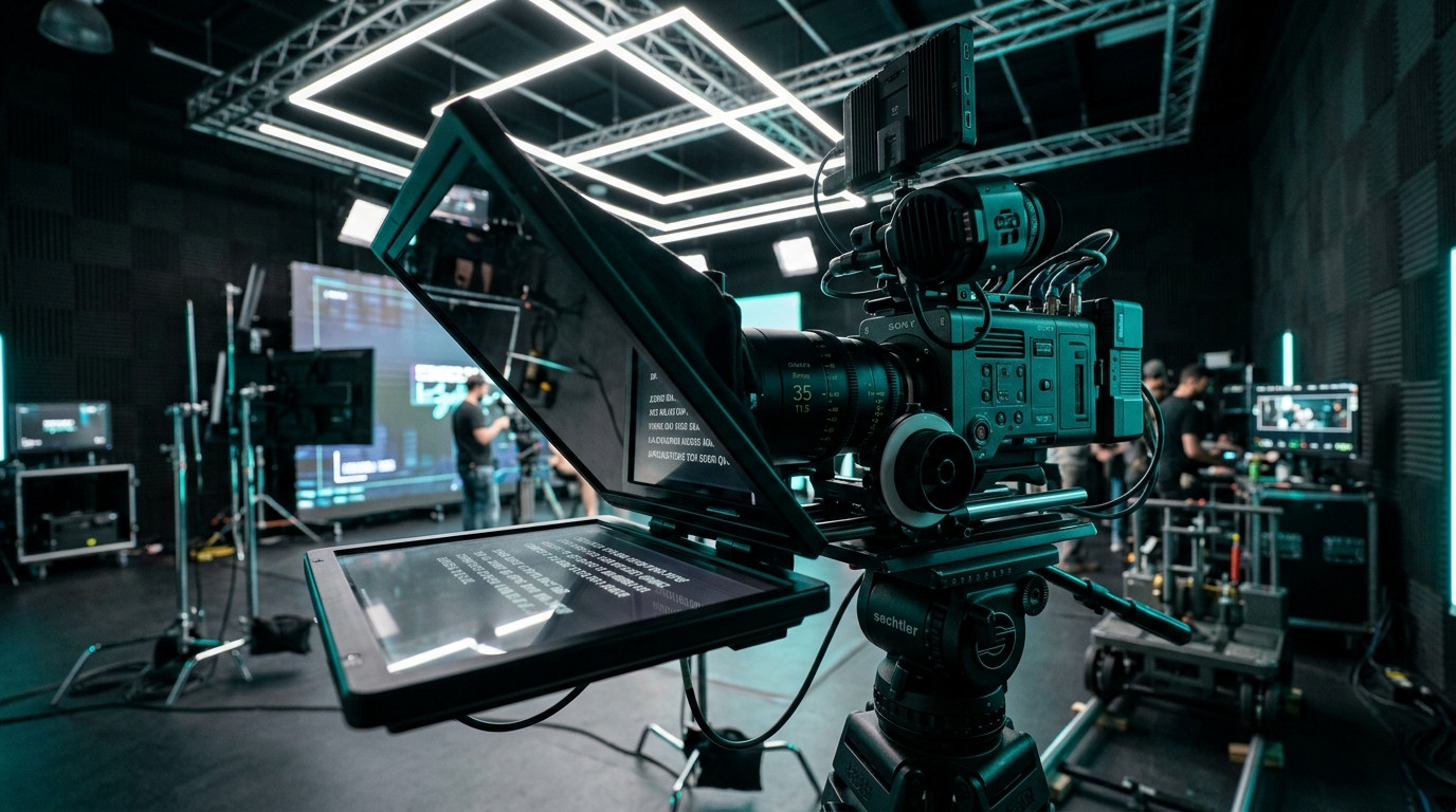
Why On-Screen Formatting Dictates Eye Movement on Camera
When an audience watches a presenter on video, human perception detects the slightest lateral shift in ocular focus. If a presenter reads wide text blocks across a 12-inch beam-splitter glass, their pupils sweep left and right across the lens axis. The audience immediately senses that the speaker is reading rather than engaging in direct personal conversation. Achieving a clean take requires more than optical alignment and lens balance. It demands careful calibration of typography, column width, line spacing, and optical contrast on the talent display.
Text layout on a studio prompter operates under different visual rules than print or web typography. In traditional editorial design, wide margins and longer line lengths offer comfortable scanning for stationary reading. On a beam-splitter rig, the text hovers directly in front of the camera lens. The goal is to funnel the reader eye line into a tight optical column centered precisely over the lens element. By treating teleprompter typography as an optical tool, you eliminate visible tracking and keep talent relaxed.
The Narrow Column Rule: Eliminating the Horizontal Eye Sweep
The single most effective formatting choice you can make on set is narrowing the text column. When sentences stretch from edge to edge on an iPad or prompter monitor, the talent must physically turn their gaze across the glass. To the camera, this manifests as rhythmic, mechanical shifting that ruins conversational authority.
Set your active text margins so that lines span no more than 30 to 40 characters, or roughly five to seven words per line. By compressing the line width, the talent reads entire phrase clusters in their central foveal vision without darting their eyes left and right. This keeps the presenter ocular focal point parked directly within the optical sweet spot of the camera lens, creating the illusion of effortless eye contact.
When using a modern web-based tool like Prompter Share, you can dial in a narrow reading column instantly without dealing with clunky monitor scaling or specialized hardware boxes. The operator controls the presentation layout while talent reads a distraction-free display tuned specifically to minimize lateral movement.
Font Selection: Geometry, Weight, and Legibility at Distance
Not all typefaces render cleanly through reflective beam-splitter glass. Script glass features a specialized dielectric coating that reflects a percentage of light toward the reader while passing the remainder through to the camera sensor. Low-contrast or thin fonts quickly bleed out under studio key lights, forcing talent to squint or lean forward.
- Sans-serif geometry: Select clean, neutral grotesk or humanist sans-serif typefaces such as Inter, Helvetica Neue, or Roboto. Serif typefaces feature delicate terminal strokes that shimmer or break apart on reflective glass under high ambient studio lighting.
- Consistent medium weights: Avoid ultra-light or hairline weights because they wash out against strong key lights. Conversely, avoid ultra-bold weights that cause interior letter counters (such as in 'e', 'a', and 'o') to fill in and blur at eight to ten feet away. A balanced medium or semi-bold weight preserves clean character boundaries.
- Uppercase versus mixed case: Never format full scripts in ALL CAPS. While capitalized acronyms and cues stand out effectively, solid blocks of uppercase text strip away ascenders and descenders. Talent relies on word shape recognition to maintain a conversational cadence; all-caps text slows down reading speed and induces vocal fatigue.
Line Spacing and Vertical Breathing Room
Tight leading causes lines of text to crowd together. When a nervous presenter loses their place for a split second, crowded lines cause them to jump backwards or skip phrases entirely. Conversely, excessive line spacing creates disjointed gaps that interrupt natural cadence.
Calibrate your line height to approximately 1.4 to 1.6 times the font size. This vertical breathing room gives the talent eye a distinct lane to track while the prompter scrolls. Pairing proper line height with a subtle line marker or focus guide helps talent lock onto the active reading zone effortlessly. In Prompter Share, tapping the T shortcut engages an instant focus guide, giving talent an anchored horizontal visual reference that eliminates hesitation during high-stakes presentations.
High-Contrast Color Profiles for Studio Rigs
Studio lighting conditions heavily influence screen contrast. High-output softboxes, rim lights, and hair lights can illuminate the glass hood or bounce off talent clothing, washing out weak display backlights. To maintain needle-sharp readability, follow strict contrast principles:
- Deep dark backgrounds: Always drive prompters in high-contrast dark mode. A deep background (#0B1416) prevents excess light from spilling forward into the hood, keeping internal reflections off the camera lens filter.
- Crisp off-white typography: Pure blinding white text (#FFFFFF) on pure black can create an optical halation effect known as irradiation, where letters appear to vibrate or glow on the glass. Using a slightly softened off-white or light cyan text tone provides maximum contrast without ocular fatigue.
- Selective visual cues: Reserve soft yellow or cyan highlighting strictly for stage directions, pause markers, and phonetic emphasis. Overusing colored text distracts talent and disrupts conversational flow.
Live Remote Typography Controls with Prompter Share
During a fast-moving production or corporate video shoot, talent preferences vary dramatically. An executive who wears progressive lenses might need a larger font scale and tighter margins, while an experienced broadcast host may prefer smaller text with wider line spacing. Traditional prompter hardware forces you to stop the shoot, open monitor menus, or re-render text layouts.
Prompter Share streamlines this entire process from any web browser. The operator manages text scaling, margin constraints, and scrolling speeds in real time from a laptop, while the talent view updates instantaneously on their iPad, tablet, or field monitor with zero software installation and no account requirement. With built-in beam-splitter mirroring toggled by the M shortcut, hardware-free frame-accurate sync, and automatic screen wake lock, your prompter display remains rock solid and legible from the first rehearsal to the final cut.